Redesigning merchandising page templates
IBM
December 2018 - February 2019

Overview
The IBM Marketplace is a platform for potential and existing IBM customers to discover, browse and navigate to IBM and third party products to solve their business problems. One of the Marketplace page templates is called a “Collections page” which is used by our merchandising team, one of our key stakeholders, to feature products and services that are grouped together by a unifying theme that the merchandisers choose.
Project objective
One of the pages on the Marketplace using this template is called the "Current deals" page which is intended to showcase products and services that have a deal going on in the IBM Marketplace. Our key stakeholder, the leader of these merchandisers, wanted the Current deals page to stand out from other places from IBM and make it very clear in the design that these products were on sale.
My role
As the design lead on the team, I was responsible for the design, research and strategy for the IBM Marketplace. I worked directly with the stakeholder to understand business requirements and a visual designer from the design system team to brainstorm potential solutions and then created designs that I worked with my development team to implement. I ensured these designs also would work for our merchandising team users who needed to use this template to create pages.
Previous merchandising collection page design
The primary requirements were:
- Use the new ibm.com design system which was being rolled out as this redesign was taking place
- Ensure designs worked on mobile devices as our design system is responsive.
- Create flexible designs that would be globalizable and localizable across 16 different languages and 50 countries where IBM operates
- Get help
- Create designs that would accommodate merchandisers content needs.
Background research and brainstorm
Competitive and internal audit
I started by doing some competitive research on similar types of pages from our competitors, or companies with a large number of products and services and looked at some ways they denoted deals, a lot of the times through tags.
I also looked at an entire inventory of card styles that had been done by our design system team as well as some research best practices.
Leverage existing research
Whenever possible, I like to leverage existing research in order to minimize duplicate work. Our team has a user research database where designers and researchers contribute their findings and recommendations on their teams to be available for other teams to learn from. I took a look through the database to find anything relevant to previous research from Marketplace or around tiles or products in general
What I learned was that user responded well to images or icons when relevant to products, but not to imagery that was distracting and irrelevant. I also learned that users responded well to product tiles that did not require interaction to find more information, such as expand collapse, and would rather read it all at once. I also learned from some click through data that users generally dropped off from our current page below the fold and clicked on tiles towards the top.
I started to sketch out some quick ideas and also used some of the existing styles that were already established to begin doing wireframes. I also took a look at competitors and saw that Microsoft and Nike really did a good job of showing what was on sale while keeping the design very clean and minimal.

Design
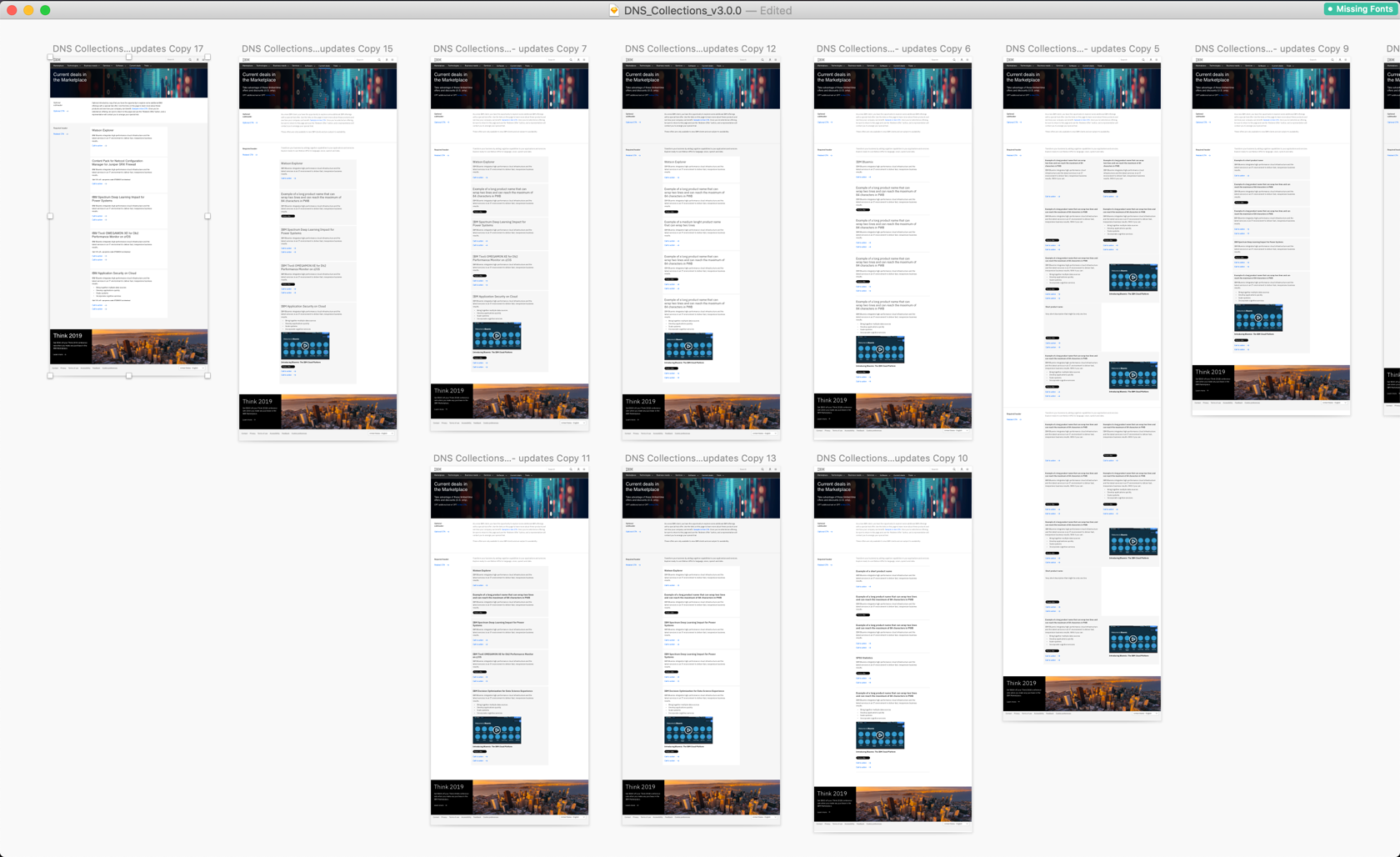
I went through many iterations of the design as I went through this project. The first iteration came out of collaboration with my team and product owner. One of the concerns was that with such varying amounts of content, the tiles varied largely in size and required different treatments and potentially different sections as any sized tile could not be placed side by side. I worked directly with merchandising team and learned that a lot of the content could be simplified and that they did not need videos or imagery.
I also worked with the design system team to work through some other versions of the design that fit within the design system standards. I started to narrow down on a design that would accommodate the needs for the merchandisers to add potentially more content to some tiles and not to others and to also provide content at the top of the page to help set the context for the rest of the page. The tiles would be stacked so as to avoid a combination of tiles of varying heights on the same row which would decrease legibility and scannability and went against our design standards.

Stakeholder approval
I then shared the designs with our primary stakeholder, the leader of the merchandising team, however, she did not approve as she had different design requirements in mind that all of us, including her team, were not aware of. Like any large design change that required updates, I took notes of all her requirements which were to make the pages more visually interesting and "look like Etsy" and she also showed me the Etsy collection page that she wanted our Current deal page to look like.
One of the constraints of designing in the Marketplace is that we pull products from our own internal catalog. Product teams are responsible for uploading their products into our catalog. One of the primary challenges we have faced is that product teams don't create consistent (both in terms of visual aesthetic style and quality) images for us to use. I made this known to our stakeholder but she said she wanted to push her team to create these sorts of pages. So my job as a designer would be to accommodate those needs and rely on our merchandising team to do the work of sourcing good imagery.
Back to the drawing board
I then went back to the drawing board of creating wireframes in Sketch to accommodate for the need to include imagery.
I started a number of different sketches and styles of tiles that could accommodate varying amounts of content and images. One of the assumptions I was making was that our merchandisers would have the ability to get good imagery that would also fit within the design standards of our images, which would need to be in either a 4:3 or 16:9 aspect ratio. I found images on the product pages themselves that were live to show examples of the images they could source from our own pages. Some were not ideal, but for the most part, they could work for our tiles.
I finalized the design that would provide different band or section style options for merchandisers to choose from depending on the variability of content. I worked through this design with both the design system team and my own development team to get closer to a design we felt that our primary stakeholder would approve of.

I presented this to the team of merchandisers and our stakeholder, as the team of merchandisers would be the ones required to put content into these designs. They asked a lot of questions about the images and how our content management system (CMS) would be able to let them handle images. Because none of them were designers, or had access to designers, they wanted to be sure our CMS would be able to provide some basic image editing functionality, such as focusing the image in one section or cropping or scaling up or down. Unfortunately, we followed up with our CMS team and those limited functionalities were not available and would not be for the foreseeable future. So the images that our merchandisers could find online, if they could even find them, would require image editing capabilities outside of our CMS to be in the specific aspect ratios required by our design system. The stakeholder also wanted the discounts to be more prominent and have it be made immediately clear that these products had discounts and to make the whole page feel more "merchandisey". We also decided to go with th more simple band or section options first, with more consistent content elements which would be the product image, title, description, discount price, and one or more CTAs
Addition of approved images and pictograms
I then started working through a design with a more prominent discount. I also worked through this challenge of image requirements. I decided that I coud work with the design system team to create a small library of images that the merchandising team could choose from that would both be aligned to the strict design guidelines for imagery and also be in the exact aspect ratio so they would not have to worry about editing. One of the design guidelines that actually made this process easier is that our images need to be somewhat abstract in nature, without people, and aligned to a similar color palette. I then sourced and edited 30 images for them to choose for their team to choose from in two sizes: one in the tile size and the other for the top section of each of these pages.
At around this time, our design system team was working on creating pictograms for the primary 16 categories that represented the thousands of products in our catalog. They were just wrapping up the designs right when I was hearing this feedback of needing more visually interesting collections page designs but the inability for merchandisers to find and edit good imagery.
So I worked through an option for merchandisers to fall back on a pictogram style tile that could automatically pull from our catalog and be mapped to the correct category so that they wouldn't have to choose an image.

Final design iterations
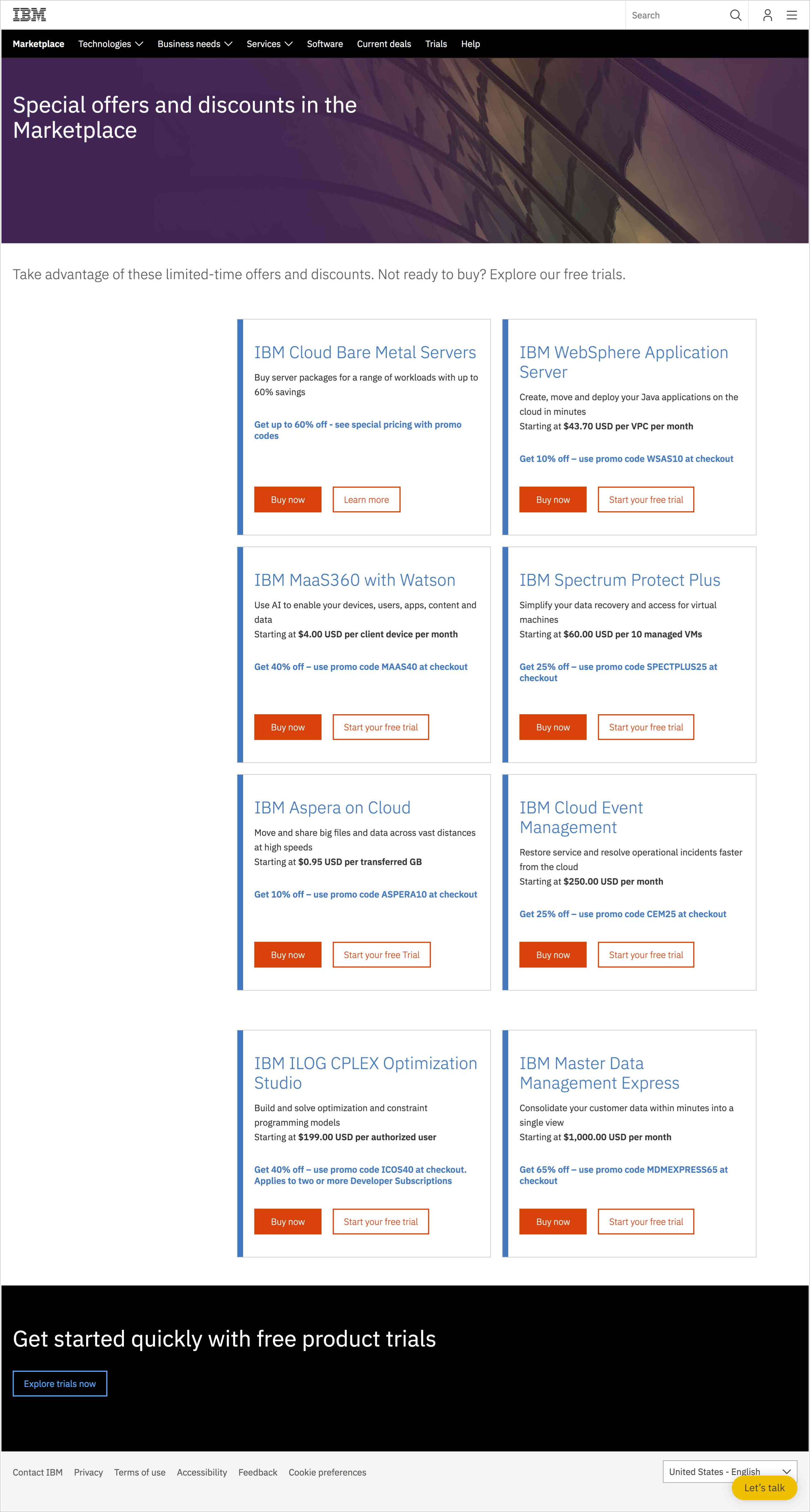
I then shared these again with the merchandising team and stakeholder and got great feedback on the designs and images. However, the stakeholder again wanted it to be crystal clear that these products were on sale. She liked the old designs that had an orange dog ear at the top right because it was immediately clear to users that they were on sale. So I worked with the design system team again to create an updated "dog ear" style for our tiles.
I created a tag style that would align to our design system and also allow for longer character counts as we have to accommodate different languages, such as german, and was able to work through those character counts with the merchandising team for each of our elements. I made sure each tile was the same height so matched the height of the worst case scenario of the largest amount of content. I then shared this final version to our stakeholder and team and she at last agreed to the design and was very happy with it.

Implementation
Once approved, I created all the mobile versions of the design that aligned to our new grid system and worked with my development team on the specific requirements of the design and how it should be implemented in our CMS. I also created an annotated design to be sure our development team would implement the designs in the CMS in a way that would provide our merchandising teams the editable, required and optional fields for them. I walked our development team through the annotations and continued to work with them as they implemented these designs.
Once approved, I created all the mobile versions of the design that aligned to our new grid system and worked with my development team on the specific requirements of the design and how it should be implemented in our CMS. I also created an annotated design to be sure our development team would implement the designs in the CMS in a way that would provide our merchandising teams the editable, required and optional fields for them. I walked our development team through the annotations and continued to work with them as they implemented these designs.
During this time, I also conducted an unmoderated user test to see what users thought of the old collections page design against the new one. We received overall very positive feedback. The only major negative feedback was around the large amount of content in each tile. I communicated this back to my team and the merchandising team and worked with them to reduce some content from the product tiles so they would not be so tall.
The template was created in our CMS in February and our developers recently launched the page which you can find on ibm.com.
