Research and redesign of IBM’s enterprise search
IBM
August 2018 - July 2019

Overview
IBM’s enterprise search is the one place for users to search for content across ibm.com, which indexes hundreds of thousands of different pages that IBM owns. I was the lead designer and researcher on this team which consisted of a product owner, scrum master, 6 developers and a project manager.
Challenge
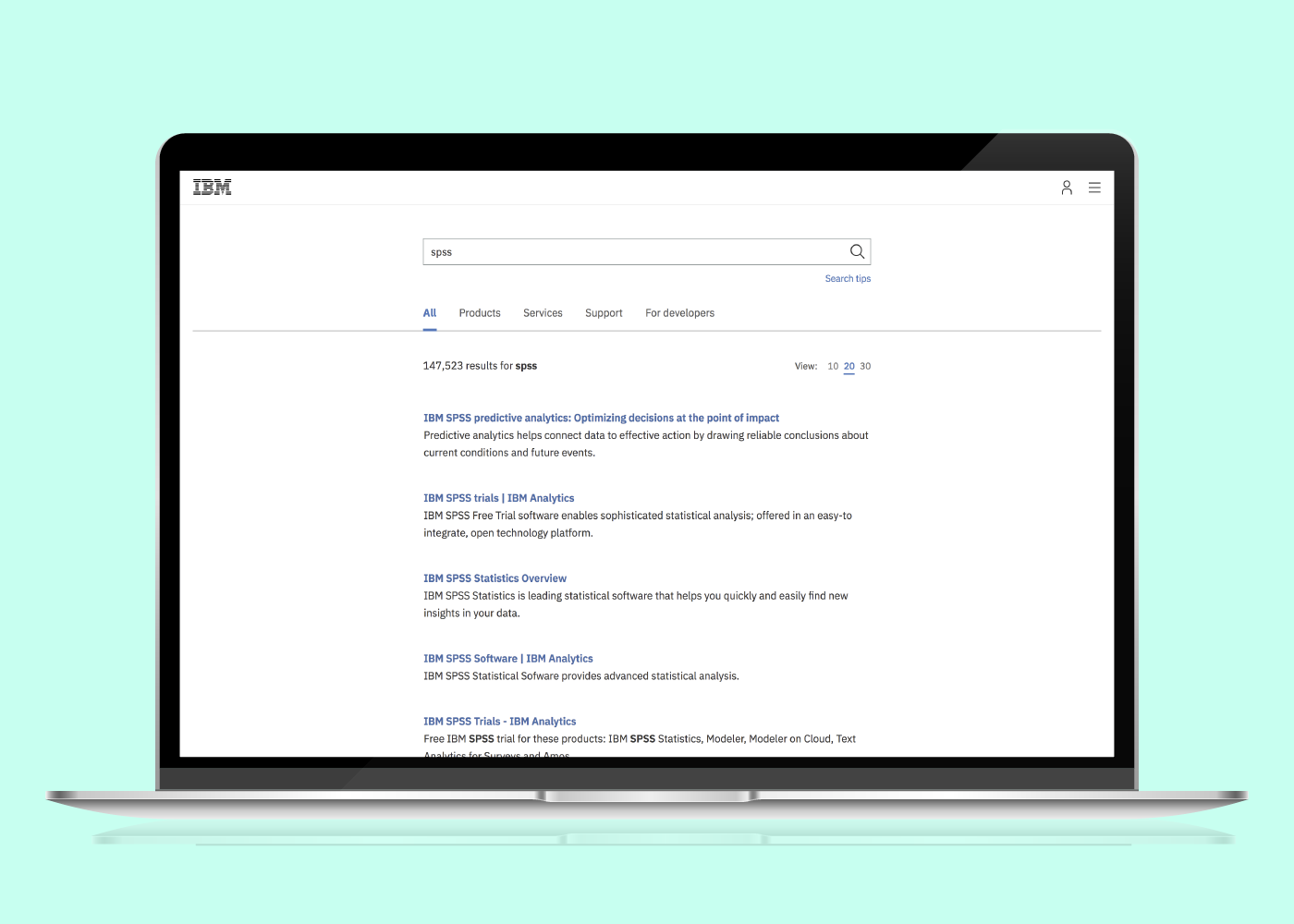
This project was initiated by the IBM Support team’s desire to make it easier for customers to find technical IBM content. As part of this initiative, it became clear that more technical content, such as product support documentation, should be indexed and surfaced in ibm.com search results. The search experience at the time was divided into five tabs (All, Products, Services, Support and For developers). There were only filters on the Products tab which allowed users to filter by product type, industry, category and whether or not it was an IBM or third party product. The IBM Support team came to our team with new proposed groupings of content and labeling (via tabs and filters) due to the new content from 8 IBM sites to be indexed.
Previous search experience design
My role
As the lead designer and researcher, I decided to do an extensive amount of research, along with another user researcher brought on to support my research efforts, to come up with groupings and labeling that would be intuitive for our users, rather than intuitive to our stakeholders alone. In doing so, it also prompted some additional research recommendations to improve the overall search experience beyond the reorganization and relabeling of content.
I helped to reframe the objective of the project:
Create a more unified search experience by indexing search results from 8 IBM technical support sites into our ibm.com search so that users can quickly and easily find what they’re looking for.
In addition, I also helped to guide our team and stakeholders to look at additional KPIs (Key Performance Indicators) than the original ones which at the time were only looking at NPS (Net Promoter Scores) and click through rates from our search page.
Background research
Content audit
First I wanted to the different content types from the current sites we indexed as well as from the proposed 8 technical support sites. I conducted a content audit to understand the content in a more systematic way and also took note of other UI elements on these sites such as filtering and sorting options, metadata surfaced in search results and any other details that were important.
Leverage existing research
Whenever possible, I like to leverage existing research in order to minimize duplicate work. I wanted to understand how users currently perceive the sites we were being asked to index by looking at previous surveys which ran on 3 of the 8 technical support sites we were looking to index. Some of the key findings were:
- Experienced users familiar with IBM knew where to find what they were looking for, whereas newer users were unsure about where to go. One user pleaded for one “unified site” to find content.
- Most users coming to the ibm.com home, search and marketplace pages were looking to either:
- Research or try a product or service
- Learn about ibm
- Find a job
- Get help
- Buy a product or service
- When asked to identify as being in a technical or business role, 70% of users coming to ibm.com search identified as technical while 60% identified as such on the ibm.com home page. This helped me to understand that the majority of users searching were technical in nature and if in fact they were looking for more technical documentation, that this initiative would be a step in the right direction in helping them find what they were looking for.
I also looked at our top search terms over the course of 2018 to understand what users were looking for:

Current analytics
I then took a lot at how our current search was performing by pulling data for the number of clicks across our search experience for the month of October. I found that ~20% of sessions found users clicking on any tab. Of those tabs, the most popular was the “Products” tab, which saw 8.87% of all sessions. Of sessions on the “Products” tab, 28.52% of those sessions clicked on a filter. Of people that clicked on a filter, 26.91% clicked on the “Software” filter.
I also took a look at competitive research to understand how our competitors handled enterprise search for industry best practices. I also looked through thought leadership content from sources like Nielsen Norman Group to understand latest trends in search.
I used all these key findings to inform future user tests as well as the ideas I had started to have in brainstorming a better overall search experience.
User research
I then worked with a researcher to conduct five rounds of user testing with 105 users to understand how to organize content based on users’ mental models in trying to solve a problem in coming to IBM and what information and filtering mechanisms were most helpful to users. The results and synthesis of each test helped shape the next test.
Between each of the user research sessions, I presented and consulted with my team to show progress as well as seek input.
The five rounds of user research revolved around the following:
- Understand how users search on different IBM sites and what, if any, methods they use to narrow results via unmoderated user tests.
- Understand users’ perceptions of labels and how they group content in an open card sort.
- Understand how current IBM customers get support on an IBM product and how they use IBM’s website to find answers to their support questions via unmoderated user tests.
- Understand if users could accomplish a series of tasks using our proposed tabs and filters to find answers to common queries using a tree test.
- Understand how IBM customers use ibm.com to solve their business problems and understand their perception of the current ibm.com search as well as the proposed MVP and future state design via moderated user test.
Design
Digital whiteboarding
As I was learning more from my internal and external user research I was maintaining a digital whiteboard using Mural.ly, a digital whiteboarding tool, as an easy way for me to keep brainstorm and share my latest thinking.
In the first mural, I kept track of the initial thoughts I gathered from a taxonomy expert at IBM. One of the ways we initially thought about grouping content was aligned to the user's buyer journey: Pre-purchase and post-purchase, with the notion of learning and training somewhere in between.
In the second mural, I started to flesh out these groupings more and more based upon the user testing and where users thought content may be located, particularly from the tree test. I retained the notion of aligning the buckets to the buyer journey. I also started to think through the actual labels.

Key takeaways to inform design
- Users expect search to work like Google.
- Users like to find answers to their questions in seconds or even milliseconds.
- Title and description are most the most important information used to judge the quality of search results.
- Most users liked to see additional information in search results, such as the content type, icons, date uploaded, date updated, etc.
- Users were immediately discouraged when they saw a high number of results returned.
- Users were most frustrated by 404s or resources not found messages after clicking on a search result.
- Most users were in favor of filters and sorting and other ways to narrow down, although the first ways users thought to narrow down was to re-enter search query.
- Industry wide terms resonated more with users than IBM branded terms. Some existing user, however, have become very comfortable with some IBM terminology.
- Users most often thought about content broken down in a way that align to a buyer’s journey.
MVP designs

I used my research to inform short term (MVP) and future state designs which were received very well by both my team members and my stakeholders.
I broke out what was in MVP vs future state by what was technically feasible in the short term vs what would require longer term UI and back-end search algorithm changes. The short term designs addressed the immediate need to re-group and re-label content which would require minimal front-end development work. It also reflected some short-term technical limitations that precluded the ability for our search engine to group different sources of content into the same front end group, which is why in the mvp state design, we have radio buttons instead of filters as we were not able to call the content from multiple new locations at once. The future state design would address the entire ibm.com search experience including UI changes and enhancements.


Implementation and tracking
Since December 2018 we have slowly rolled out the MVP state designs. We have been tracking our NPS which has seen an average rise in 10 points. We also hope to, with the implementation of an analytics tool here in IBM, to understand what users do once they click on one of our search results. We eventually would like to track conversion rates down the funnel from our search and eventually to revenue as that gives a more cohesive picture of page performance than simply click through rate.
This also helped to inform updates in the future state design, which also coincided with a new design system that was launched on ibm.com.
Future state designs
As I was tracking performance, a new version of the IBM design system was being rolled out, which included changes to global design elements such as the navigation, from which search is accessed. I worked very closely with the visual designers and information architects on that team to ensure future state designs incorporating the new design system would work.
One of the biggest drivers for this new design was my hypothesis that people still could not find what they were looking for (based on high bounce rates and low NPS scores) was not only due to some technical performance issues, but also the fact that people didn't often use our tabs. I decided to move forward with a design with no tabs that also incorporated new design elements and components from the new design system.
I also incorporated more information into each search result. I heard from user research and from stakeholder feedback that it was difficult to differentiate between the different types of search results, for instance if it was a product, or a webpage, or a support document. I also heard from users that the more information that was shown up front in the search results page, the more positively they viewed the search page as it helped give them more information to what they would find if they clicked on the search result.
The new designs were received positively by both my team, visual designers and information architects from the design system team. The designs are still being implemented slowly.
You can view the whole prototype which I created to demonstrate the new designs below.

